
Designing the FOXOLIFE suite — a responsive customer quote and application, a customer dashboard, an admin support dashboard and the personalized Longevity Report — for a life-insurance platform built on epigenetic science.
FOXO is changing how life-insurance companies underwrite and sell their products — using a platform driven by molecular biotechnology and the science of epigenetics to give customers a personalized Longevity Report along with their policy.
I owned UX/UI across the FOXOLIFE suite: the customer Quote and Application, the customer Dashboard, the Admin Dashboard and the Longevity Report — partnering with product owners and engineering to take patterns from heuristic review through to production.
Life-insurance is dense — long medical surveys, eligibility checks, documents and policy states. The work was to remove friction across a multi-step journey while giving admins fast, confident access to every piece of a customer's file.
A note on imagery: many FOXOLIFE assets remain proprietary. The screens shown below are the public-shareable subset of the work I did across the suite.
FOXOLIFE is the first life-insurance product to pair a policy with a personalized Longevity Report — using epigenetic science to show how lifestyle and environment shape lifespan. The customer journey moves through five clear steps, from quote to Longevity Report.
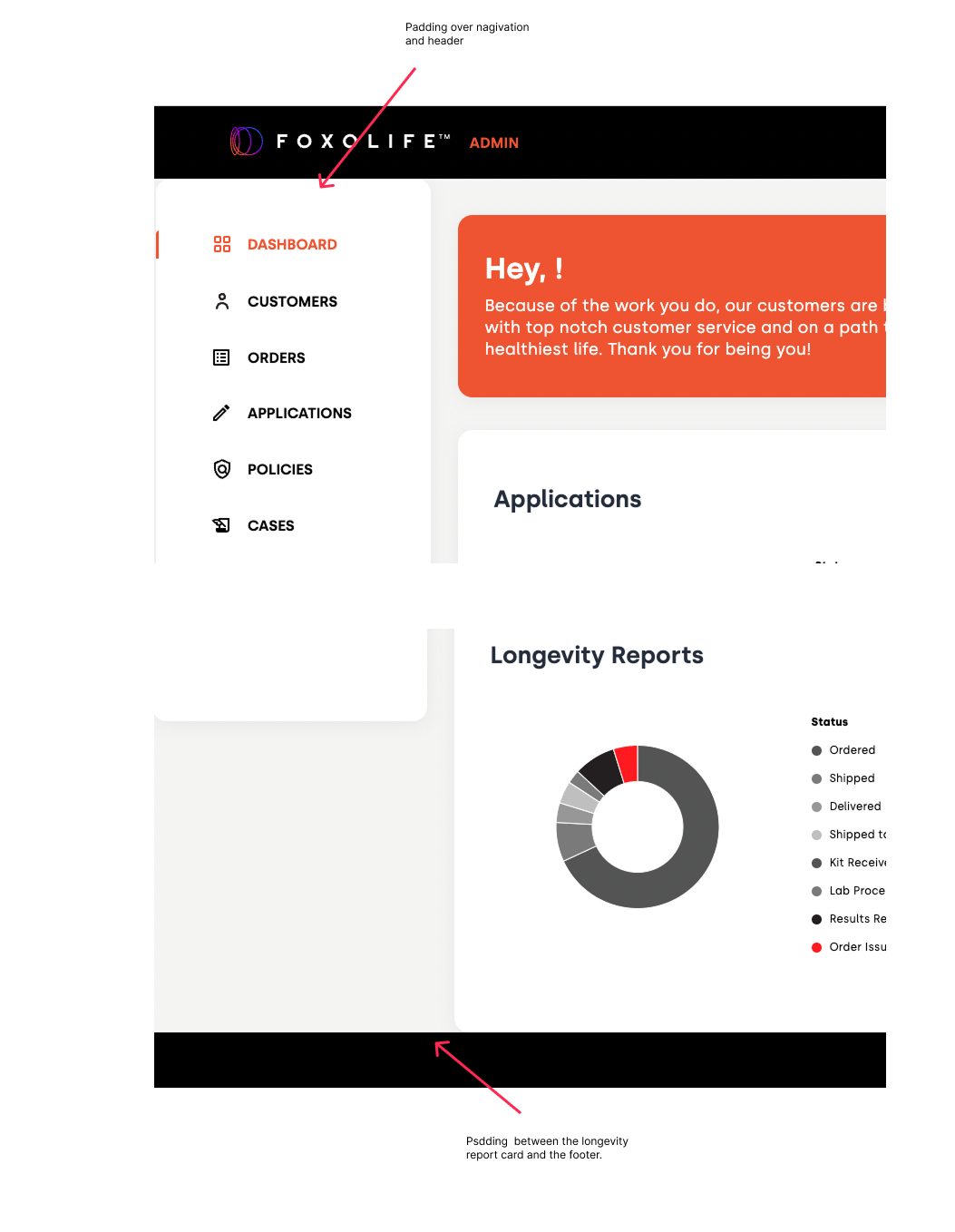
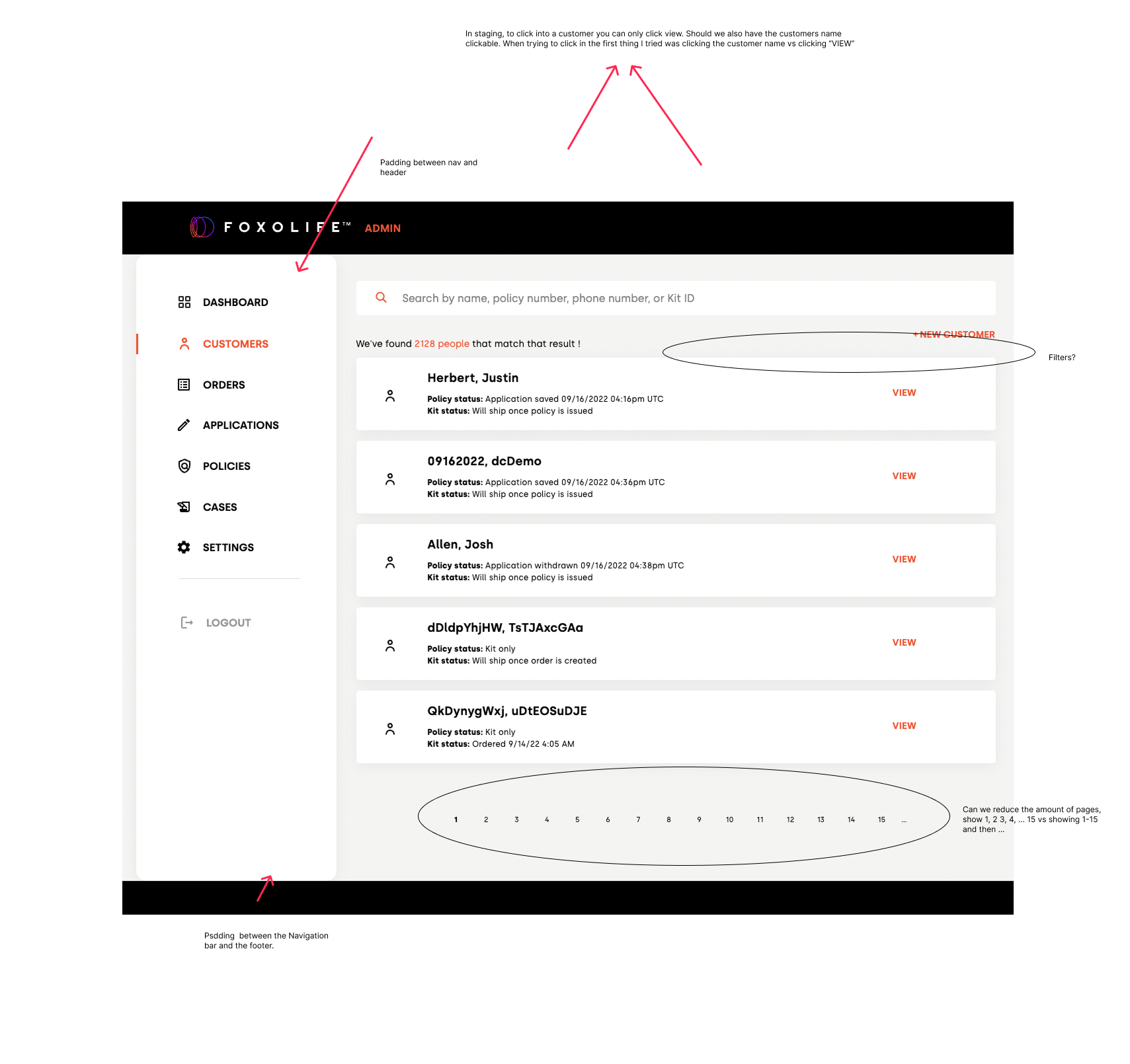
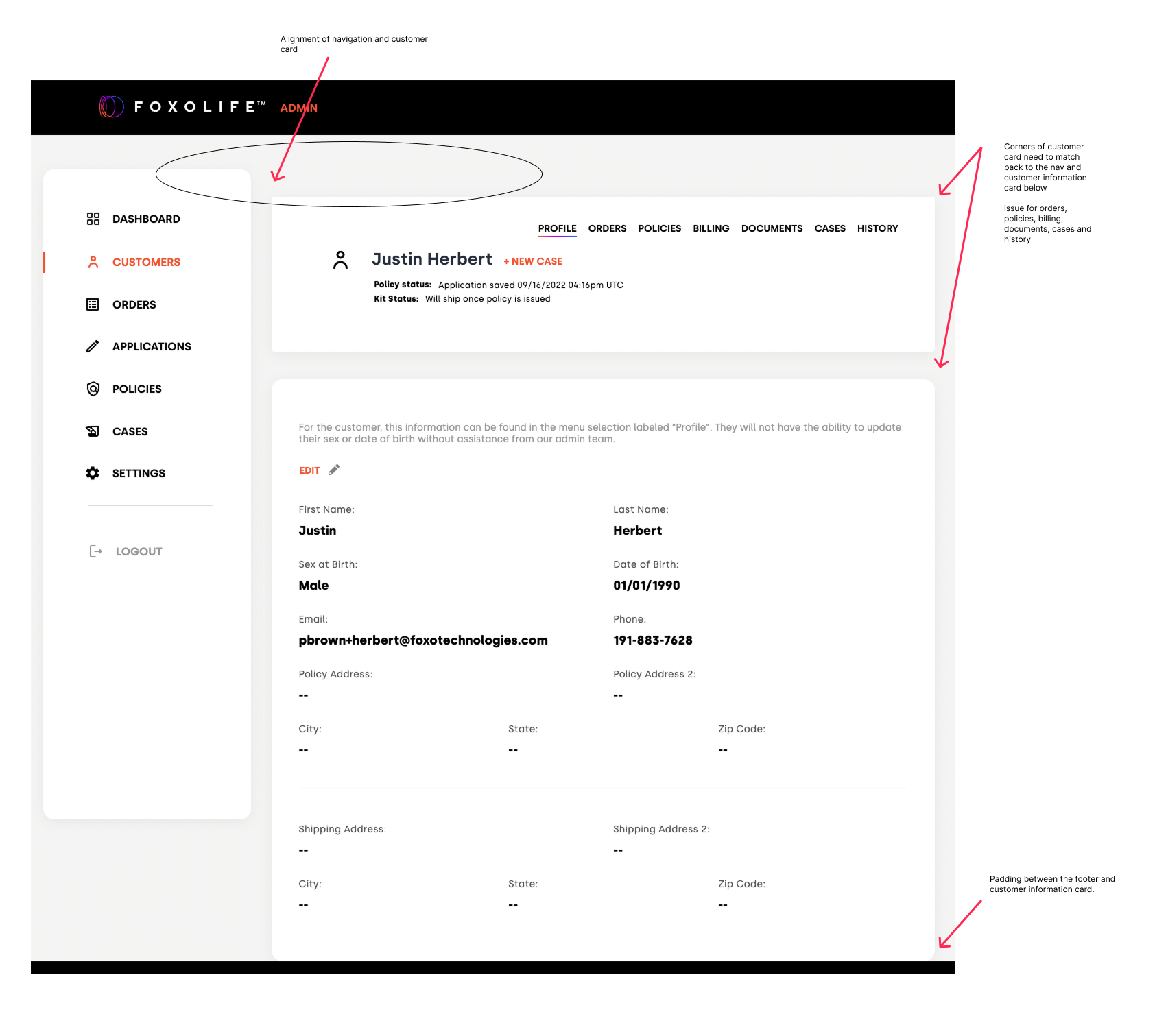
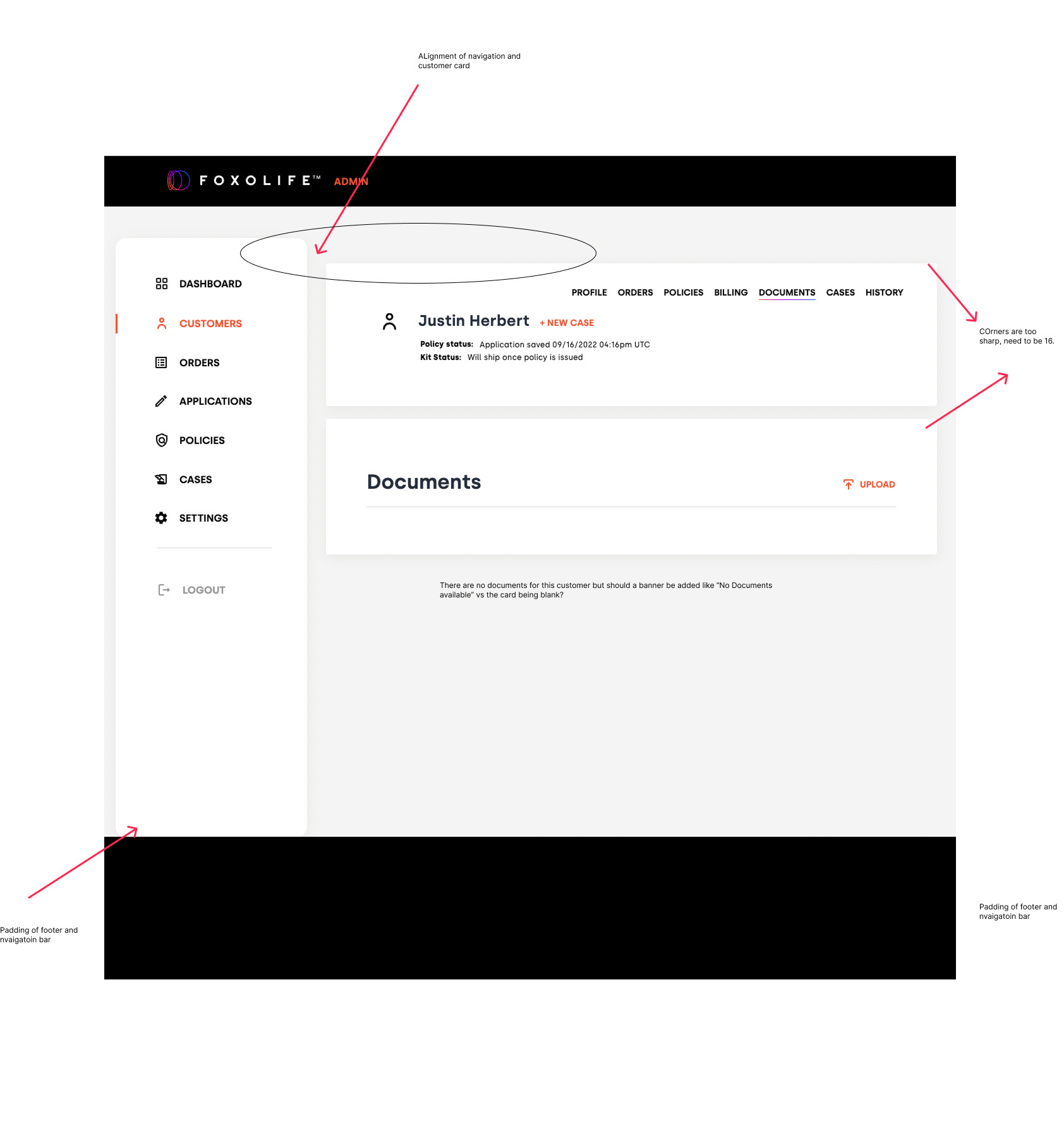
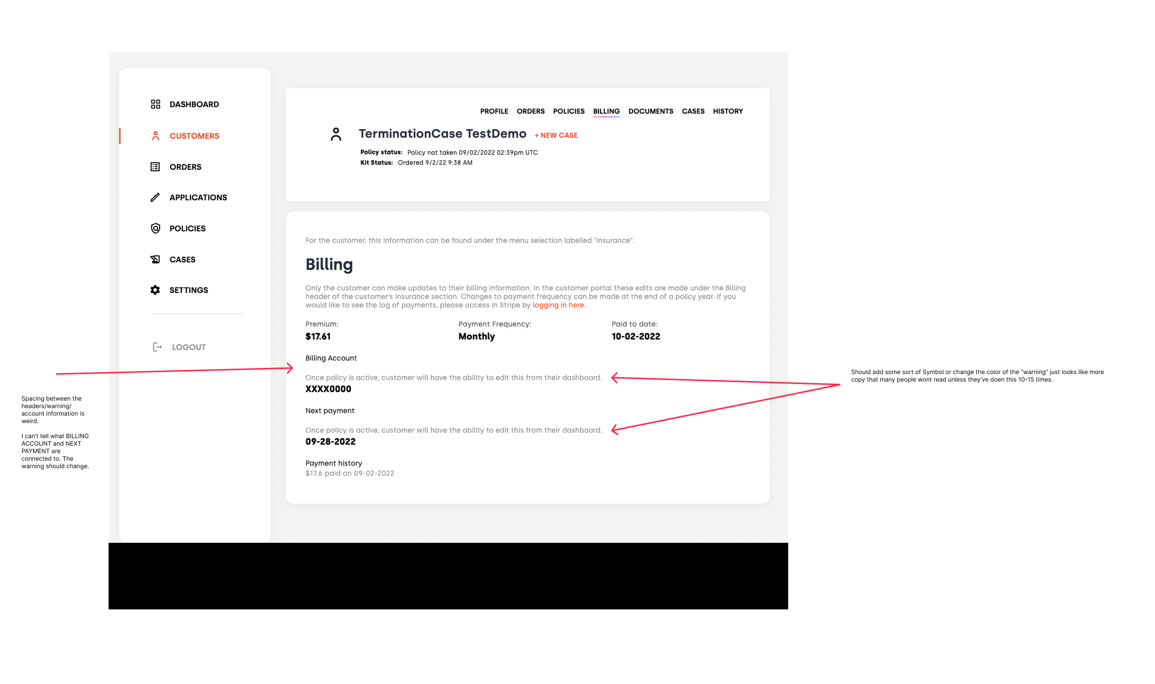
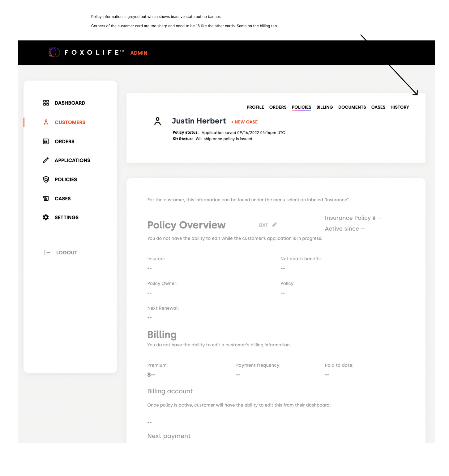
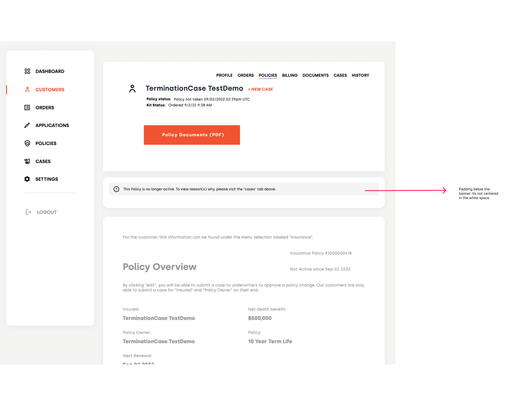
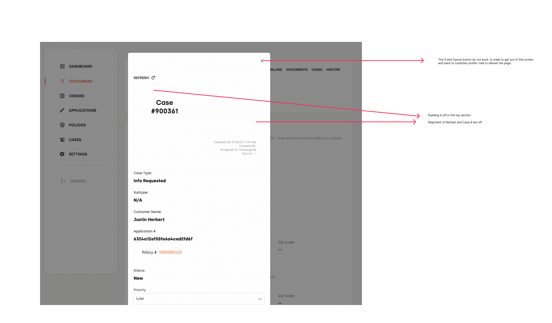
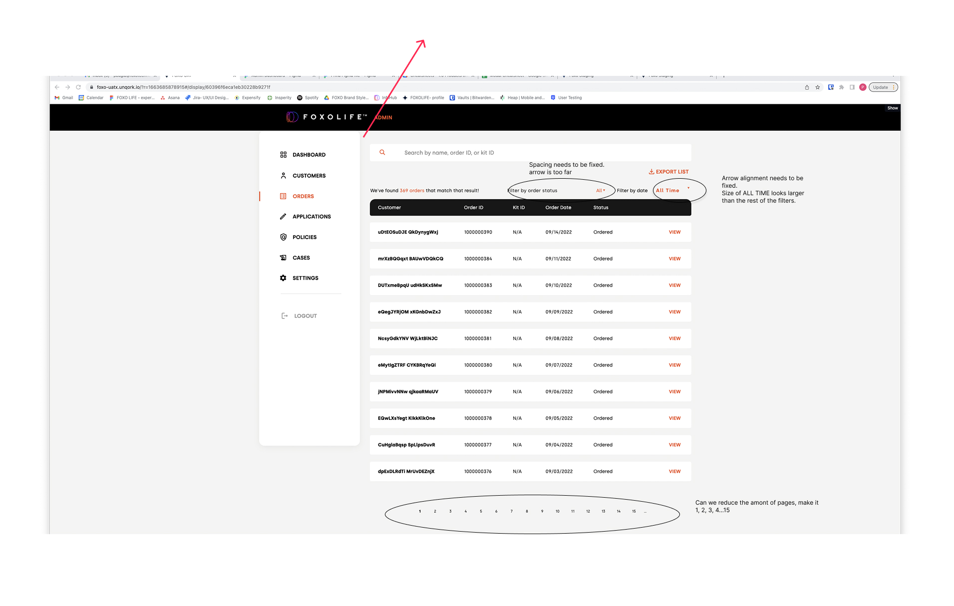
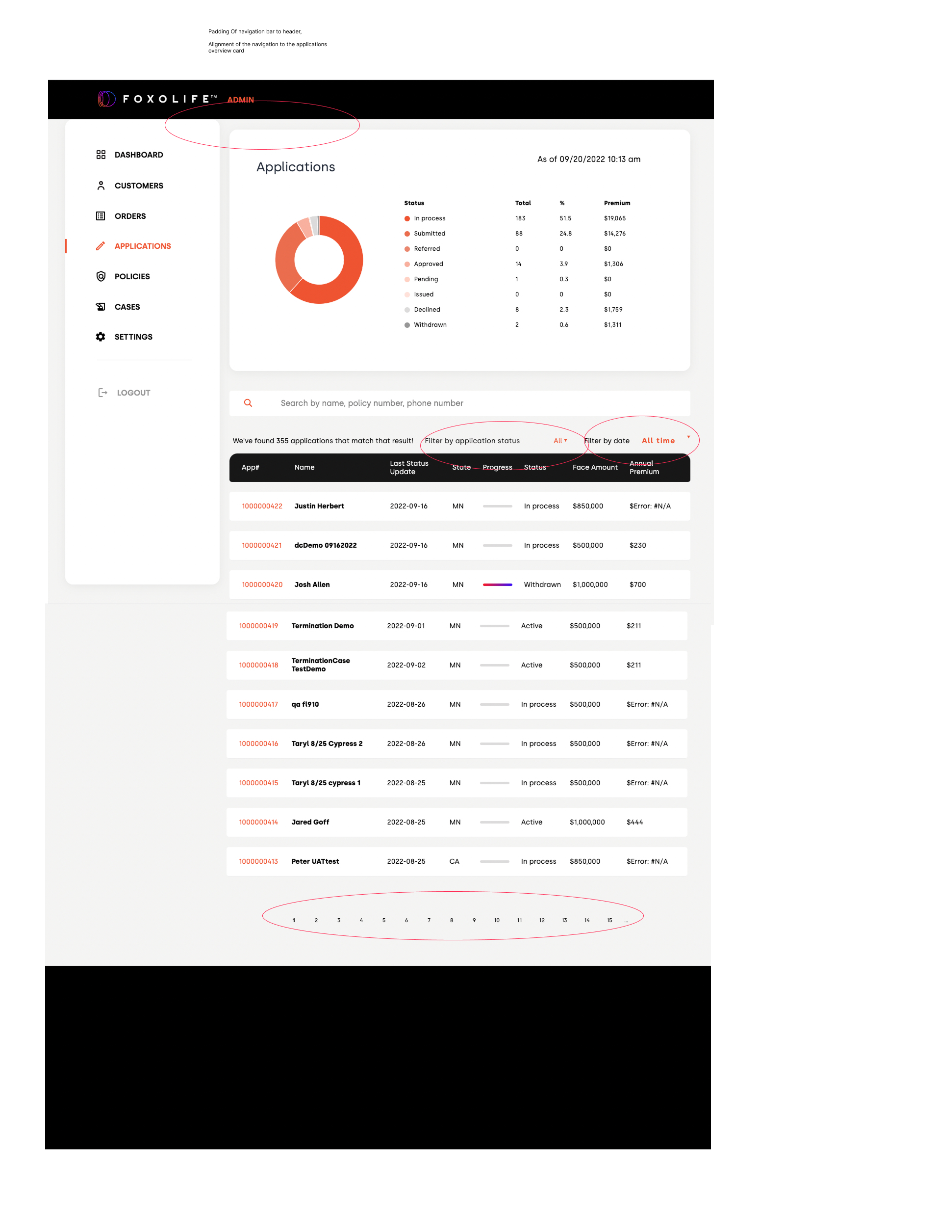
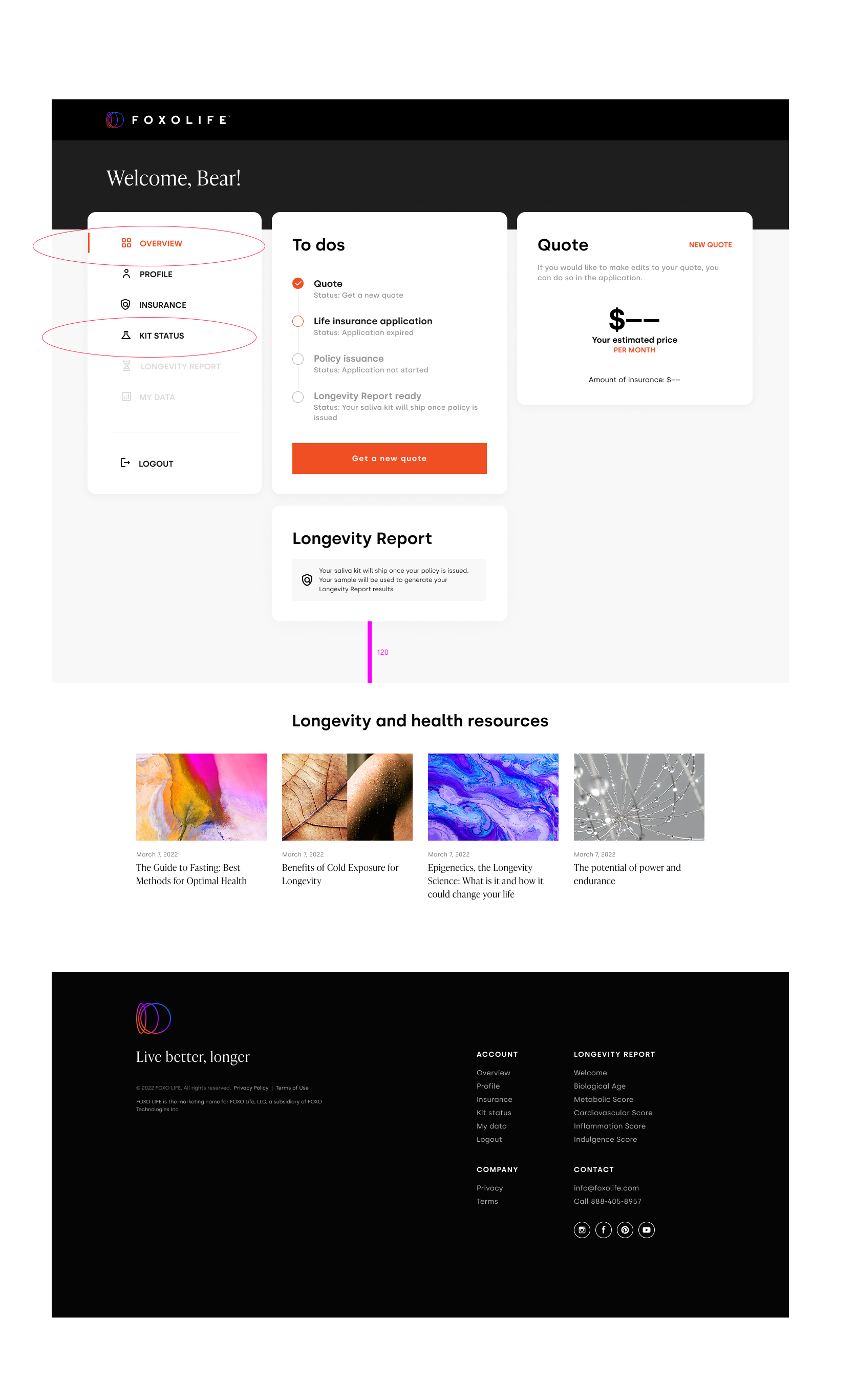
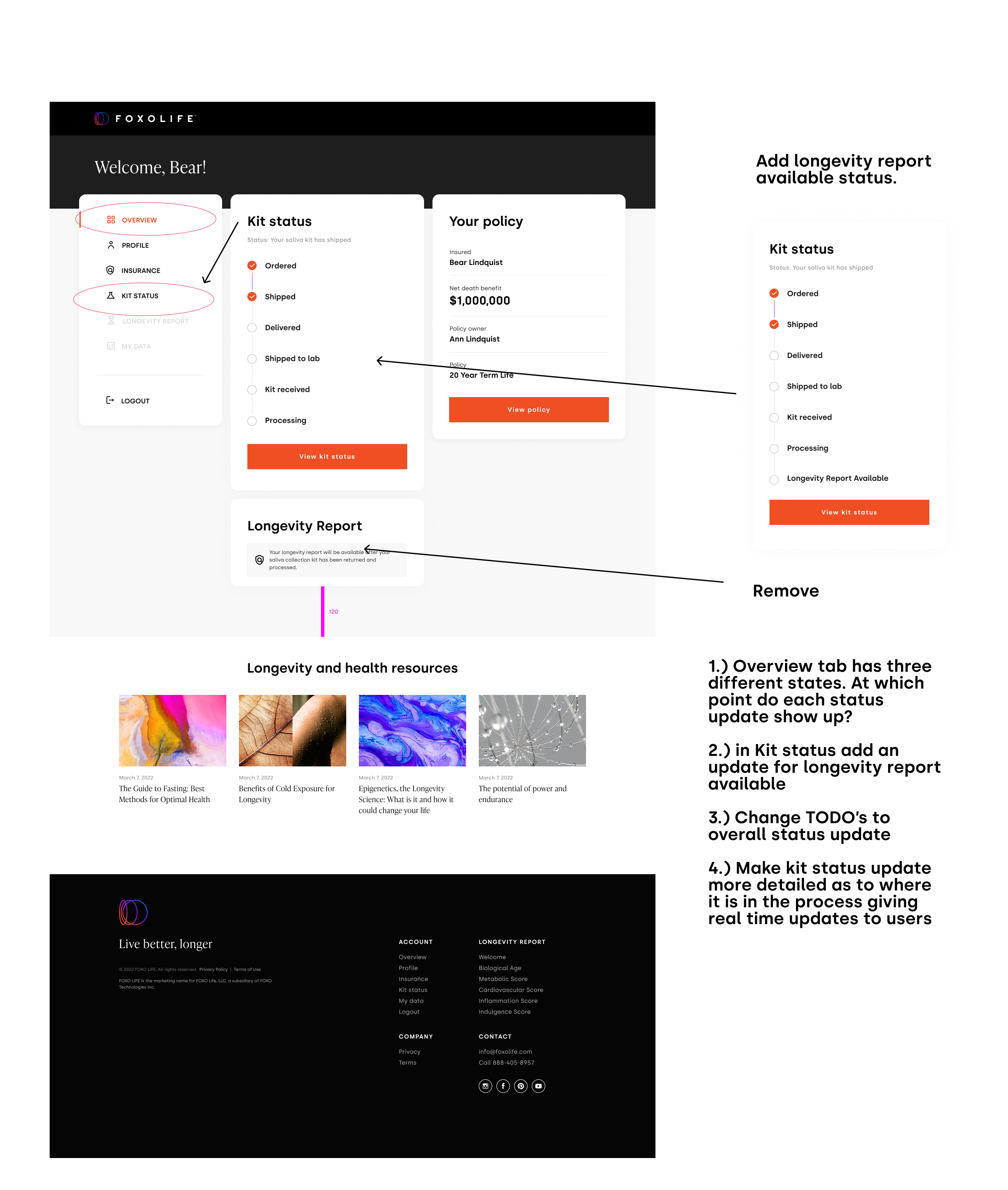
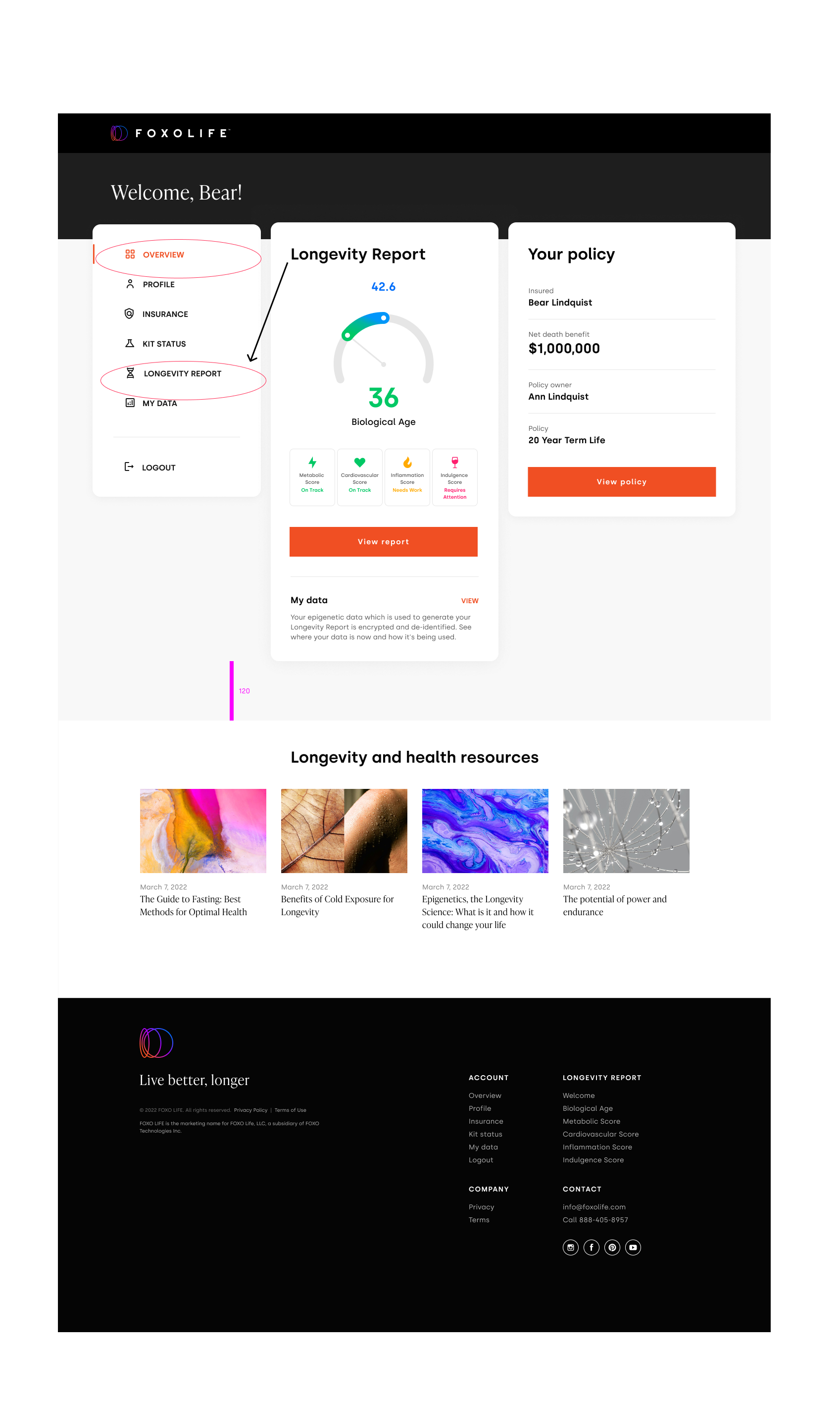
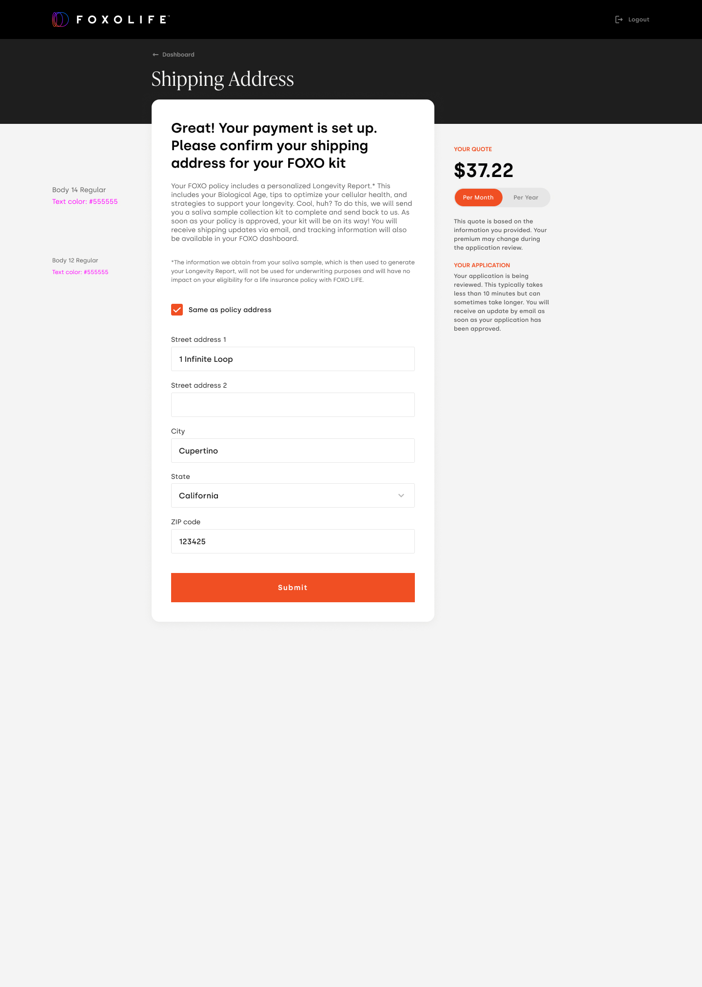
When a product is already built, my first move is a heuristic / UI QA pass — going through the experience as the end user, then noting what to fix and what to keep. I walked both the customer-facing FOXOLIFE journey and the internal admin platform, capturing alignment, spacing, state, copy and interaction issues page by page. The screens below are excerpts from that review, redlined in place.
Catch every small friction before it compounds — across both the customer journey and the admin tools — and give engineering a clear, redlined punch list to act on.
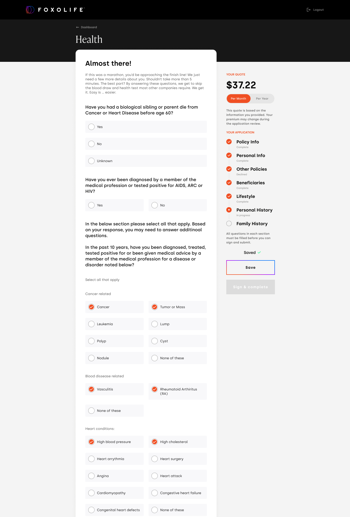
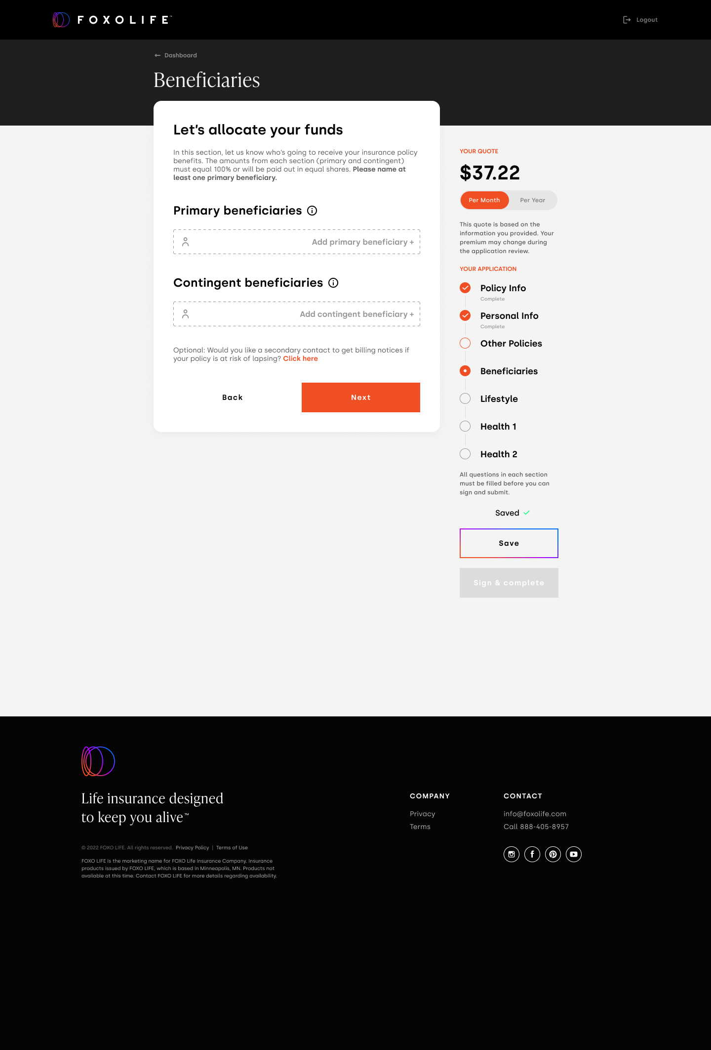
The application carries a long medical survey — deliberately, to remove the in-person medical exam from the underwriting process. The pain point was the sidebar: it let customers jump around, leave sections half-finished, and lose track of where they were. I restructured it as a linear flow with explicit section states, so customers always know what's done, what's left, and what they're in the middle of.
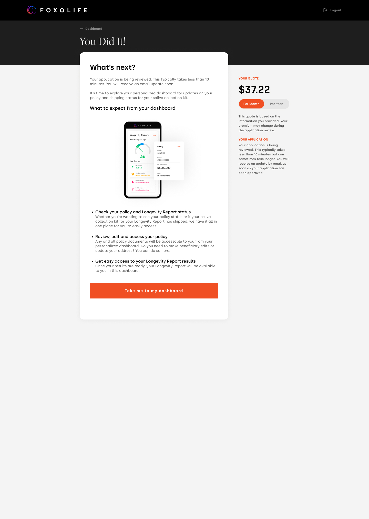
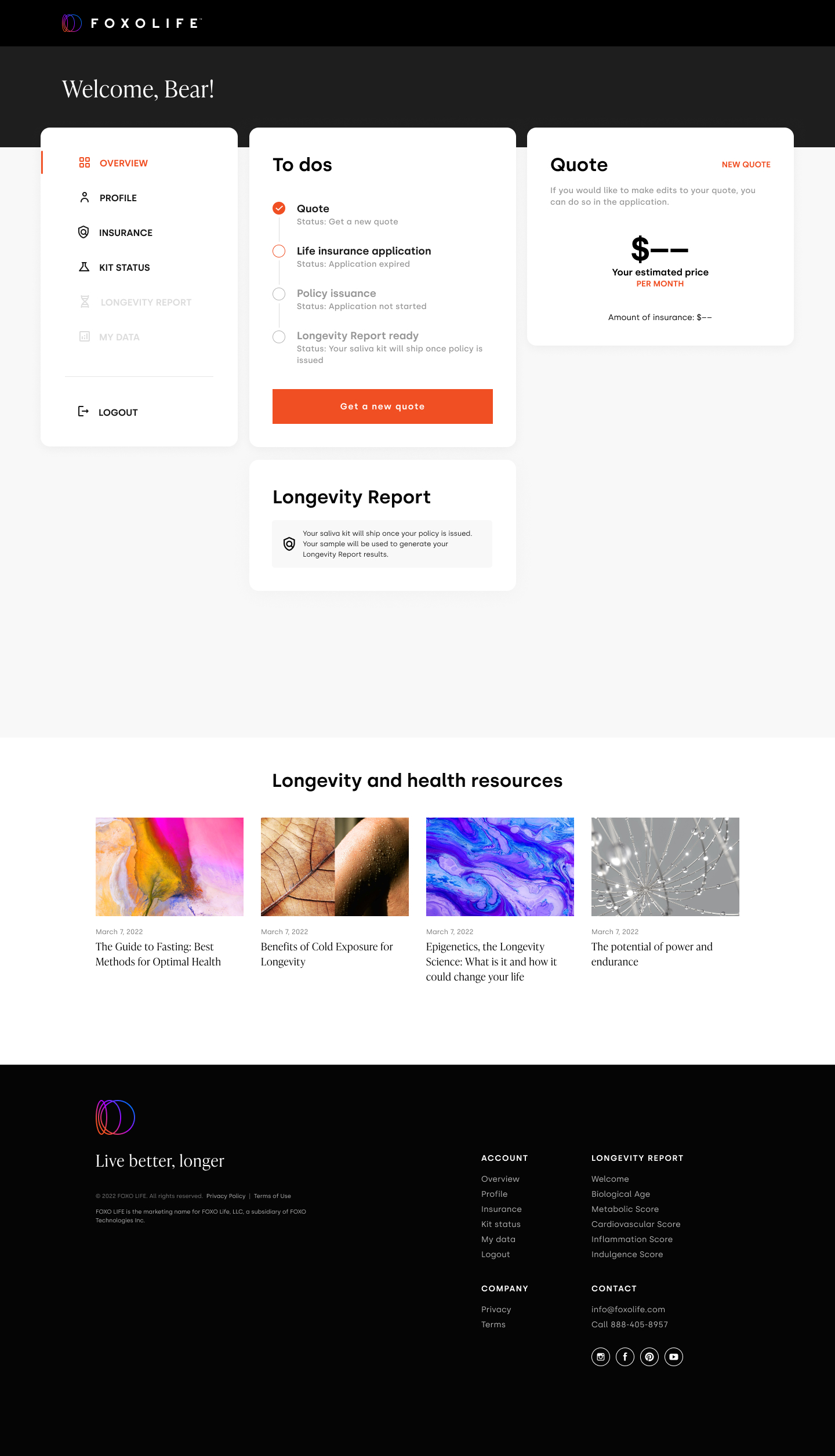
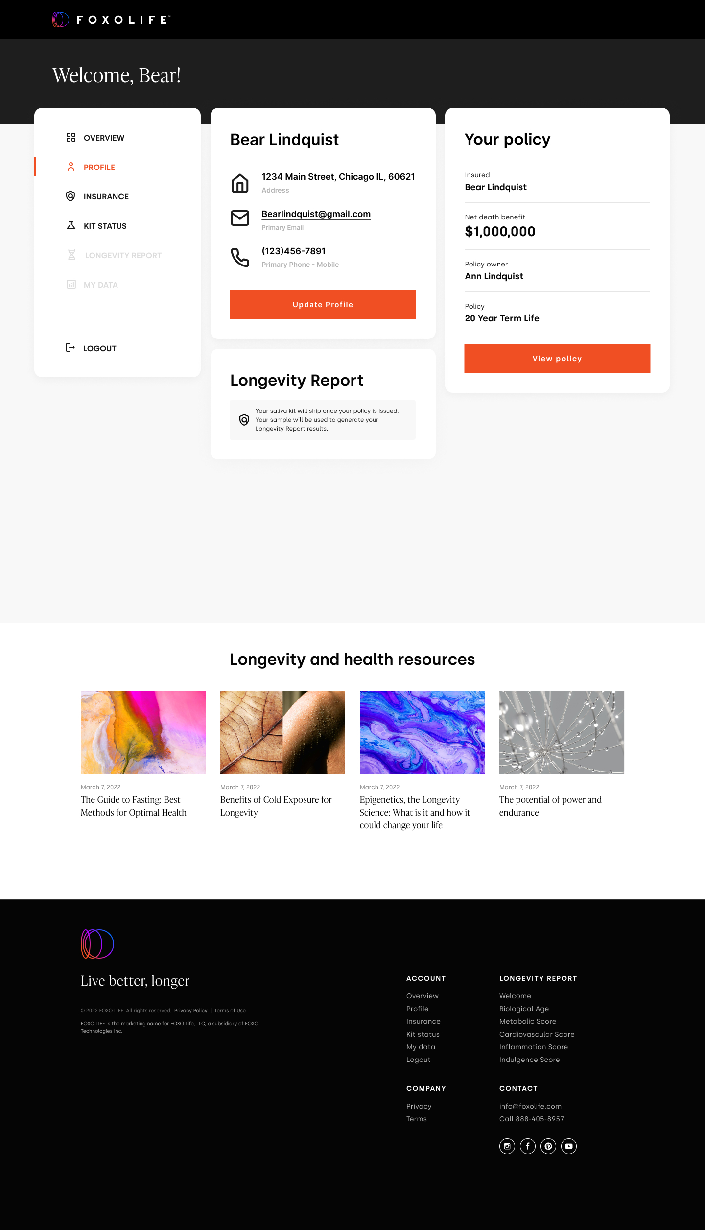
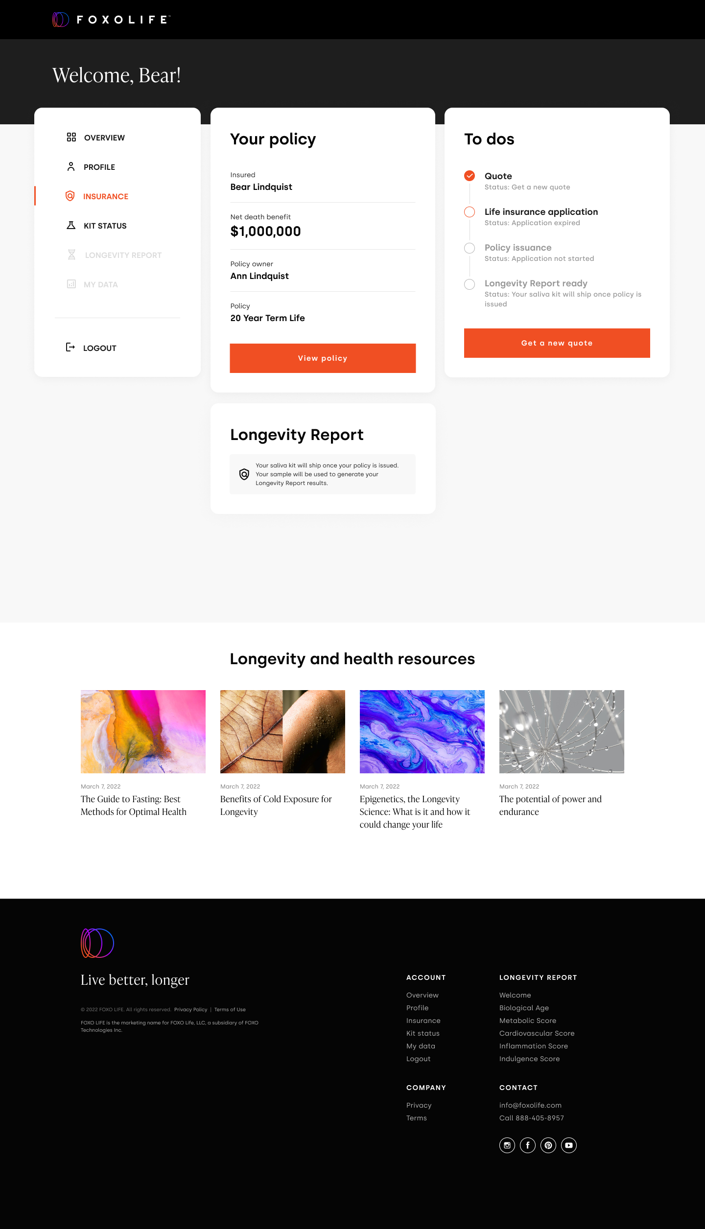
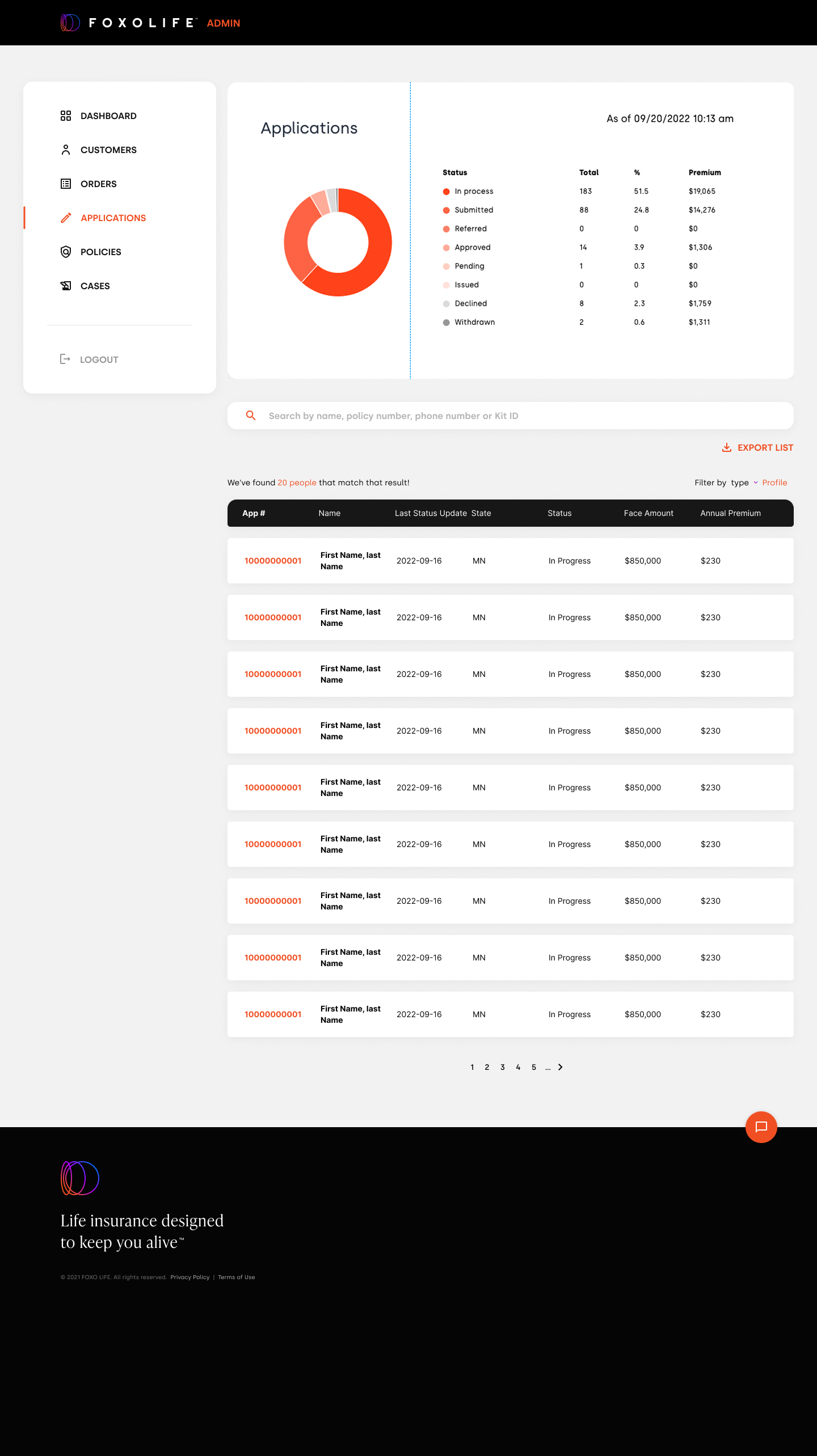
FOXOLIFE runs on two distinct dashboards — one for customers managing their own policy and Longevity Report, and one for the admin team working behind the scenes. Each one carries the same data model, but the surface area, density and priorities are completely different.
Design two dashboards that share a data model but serve very different jobs — calm clarity for the customer, dense access for the admin.
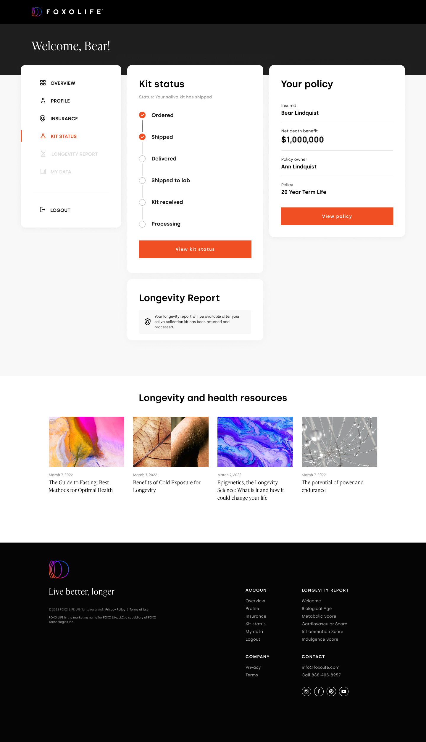
A focused space for the policyholder — track the status of their FOXO kit, view their policy, and unlock their Longevity Report once their epigenetic results are in.
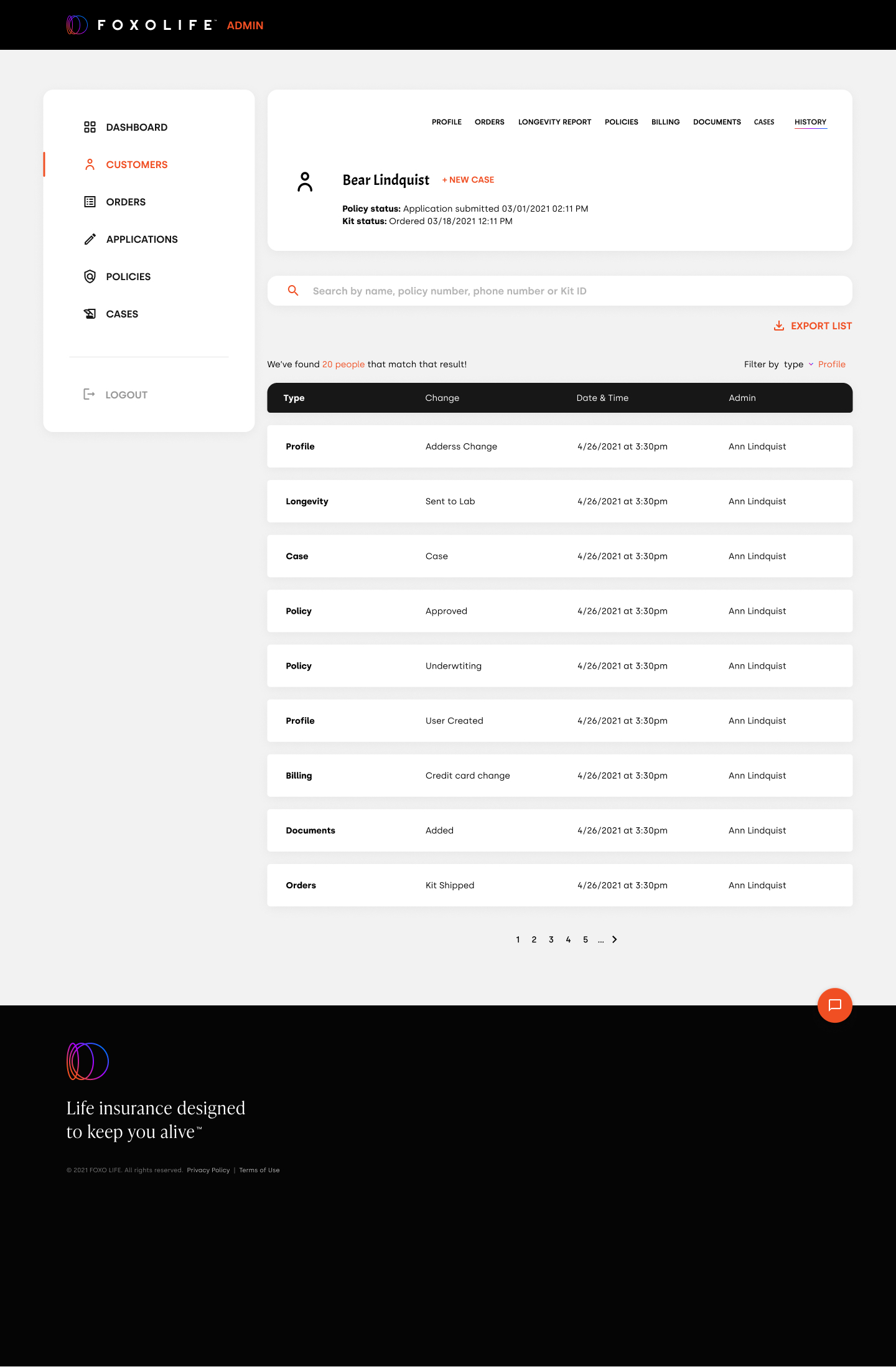
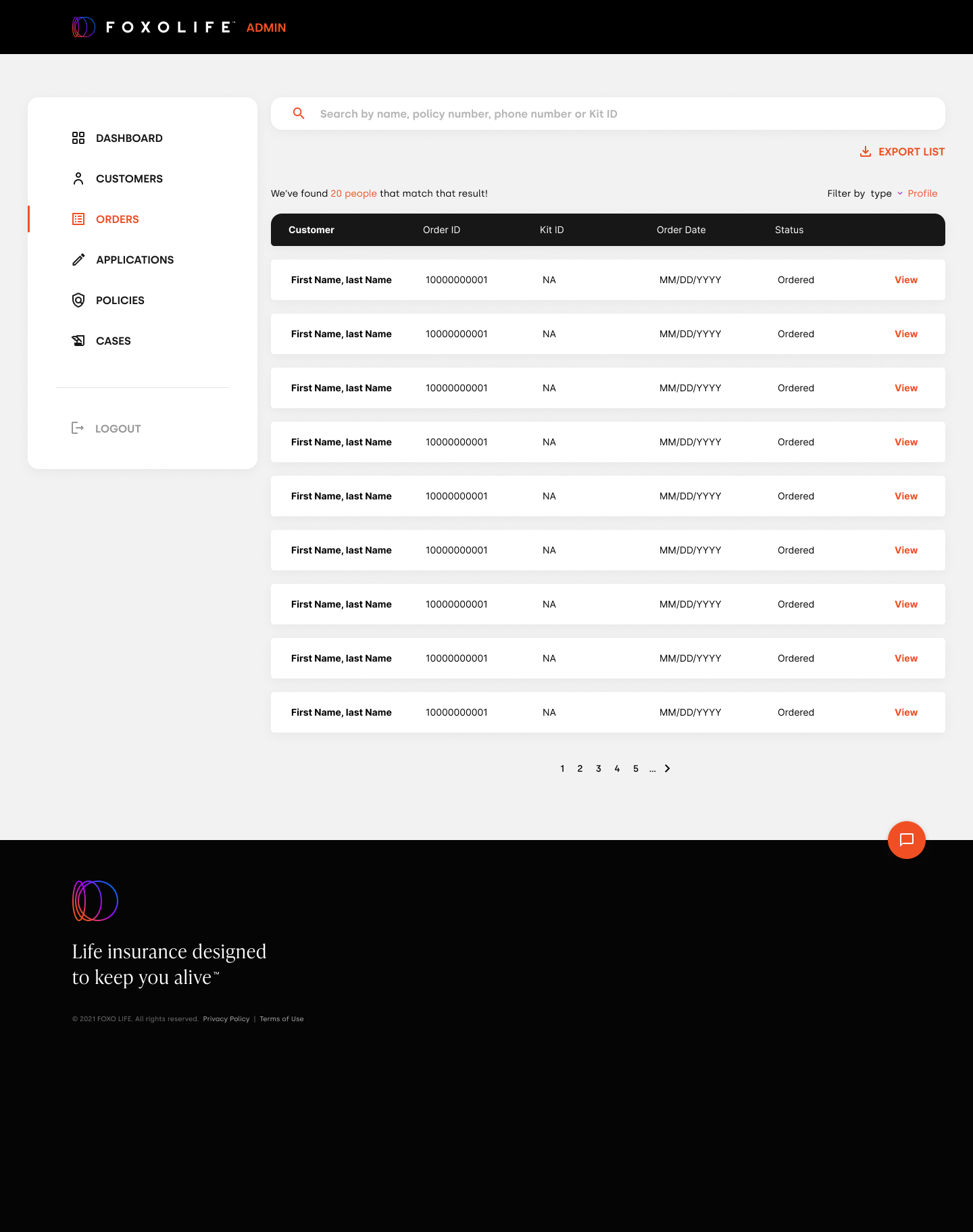
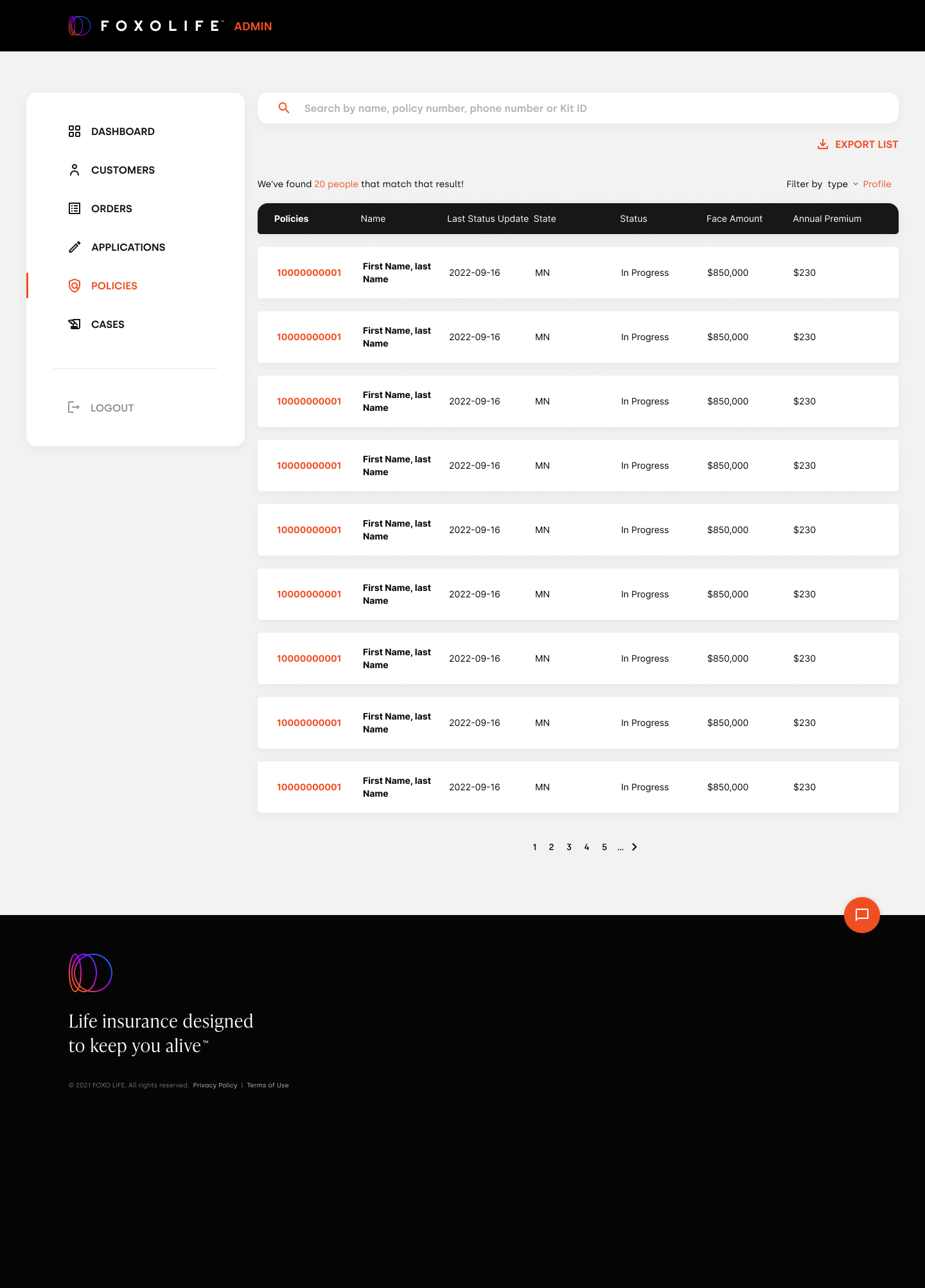
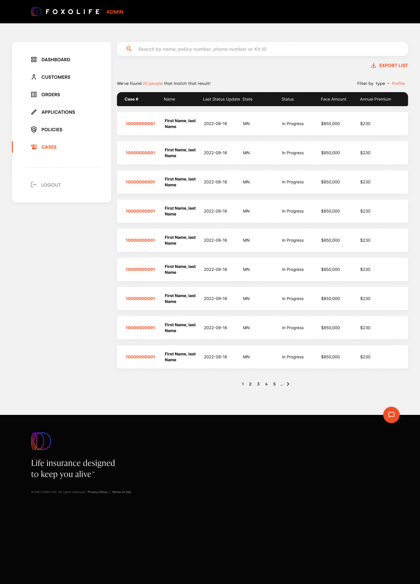
A working dashboard for the admin team — metrics and to-dos up top, then deep access into every customer's orders, applications, policies and cases.
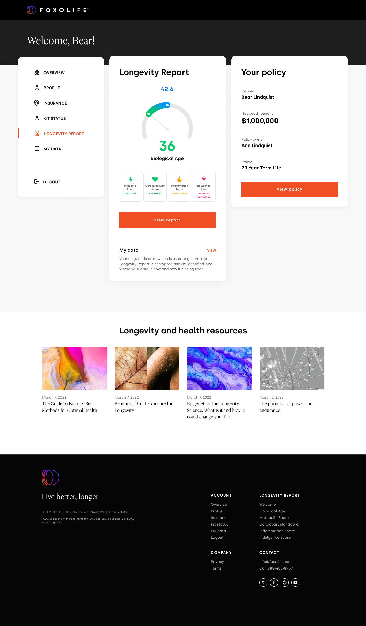
The Longevity Report is what makes FOXOLIFE different — every policyholder receives a personalized report based on their epigenetic data. The design had to translate dense scientific content into something readable and motivating for a customer reading it for the first time.
UX/UI at FOXO meant design, but also process, documentation and coordination. The work touched every FOXOLIFE surface and the operational practices around them.